
You’ve got a great product, a sleek design, and the traffic to match, but those sales just aren’t following through. Why? You’ve tried every optimization trick in the book – prettier themes, urgency timers, and trust badges – but it’s still crickets at checkout.
Want to know why?
High-converting product pages don’t need more flashy elements; they need less friction.
Think of it like this: adding more features to your page is like packing a suitcase with clothes you’ll never wear. It’s the hidden roadblocks (price confusion, slow load times, and surprise charges) that are the real conversion killers. What you need is a clear, friction-free path for your customers to follow from curiosity to checkout.
We’re going to show you 8 ways to build high-converting product pages, help you remove those blockers, and start turning visits into actual sales.
1. Write product descriptions that convert
A high-converting product description is one that clearly communicates the benefits, the product details, and the trust signals a customer needs to make a purchase. It removes uncertainty and answers the questions that often stop visitors from buying.
What problem does this solve?
A product description should open by explaining the problem the product solves or the outcome it delivers. This immediately captures attention and establishes relevance. For example: “Sleep better on hotel-quality sheets.”
What exactly am I getting?
List the product features, specifications, and variations in a clear, scannable format. Customers need precise details to make confident decisions. Example: “1,000-thread count Egyptian cotton stays cool in summer, warm in winter. Pre-shrunk, deep-pocket design fits mattresses up to 18 inches.”
Why should I trust this will work?
Include proof points such as quality standards, customer results, or testimonials. This reduces hesitation and builds credibility. Example: “Pre-shrunk design prevents shrinking after washing, ensuring long-term comfort.”
Configurable products
For products with multiple options, offer a variety of field types to provide flexibility. For example, allow customers to choose from material swatches, or use other field types like radio buttons or checkboxes for easy selection. With Advanced Product Fields for WooCommerce, you can dynamically update images, pricing, and product information as customers select their choices, making the process smoother and reducing surprises at checkout.
Additional best practices for product descriptions:
- Use language that reflects your customer’s goals, frustrations, and expectations.
- Structure descriptions with headings, bullet points, and short paragraphs for fast scanning.
- Include all relevant details such as size, materials, care instructions, or warranty information.
- Mention key benefits in the first 2-3 sentences to capture attention quickly.
2. Optimize images for desire and clarity
High-quality images are essential for turning visitors into buyers. They reduce uncertainty, show off your product, and create an emotional connection. A well-structured image strategy covers 5 key types:

- Hero image: The main visual that immediately communicates the product and its appeal.
- Detail shots: Close-ups highlighting materials, textures, or unique features.
- Scale references: Show size or dimensions so customers understand proportions.
- Variation images: Display color, size, or style options clearly.
- In-use demos: Lifestyle images or people using the product to demonstrate context.
For customizable products, dynamic image swapping is important. As customers select different options, the hero or main product image should update instantly to reflect their choices. Advanced Product Fields makes this much easier, providing real-time visual feedback that eliminates guesswork and surprise at checkout.
Adding video or GIF demonstrations is especially effective for complex products. Showing the product in action – assembly, functionality, or a 360° rotation – helps customers understand exactly what they are buying and builds confidence.
Product pages with clear, engaging images increase desire, reduce hesitation, and guide customers confidently toward purchase.
3. Master the 3-second mobile performance test
A high-converting product page loads fast – especially on mobile. Studies show that most visitors abandon pages that take longer than 3 seconds to load, which means speed directly affects your sales.
How to hit the 3-second mark:
- Compress images: Reduce file sizes without sacrificing quality to improve load times.
- Defer scripts: Delay non-essential JavaScript so the page renders faster for users.
- Audit plugins: Remove or replace slow or redundant plugins that block performance.
Use tools like Google PageSpeed Insights to check mobile performance regularly. Aim for a consistent load time under 3 seconds and track Core Web Vitals metrics like LCP (Largest Contentful Paint), INP (Interaction to Next Paint), and CLS (Cumulative Layout Shift).
4. Structure content for humans who scan and bots who rank
A high-converting product page balances readability for visitors with crawlability for search engines. Most users scan pages instead of reading every word, so structure matters.
Above-the-fold priorities:
- Product name and main keyword to immediately signal relevance.
- Price so customers know what to expect.
- Call-to-action (CTA) is placed prominently for fast conversions, for most stores this will be the “Buy Now” or “Add to Cart” button.
Revealing additional details as users scroll can improve engagement. Start with the most important information above the fold, then gradually introduce specifications, benefits, and trust signals. This progressive approach keeps the page clean, avoids overwhelming visitors, and guides them naturally toward a purchase decision.
The heading hierarchy should be clear and logical, using H2 and H3 headings to organize content. Headings should accurately describe the section’s content, allowing both visitors and search engines to easily navigate and understand your page.
Product titles should be concise but descriptive, ideally between 75 and 100 characters. Including key details such as size, color, or model helps customers and search engines quickly understand the product while capturing attention in search results.
When content is structured in this way, visitors can quickly find what they need, hesitation is reduced, and both engagement and search performance improve. Pages that humans and bots can navigate efficiently are more likely to convert.
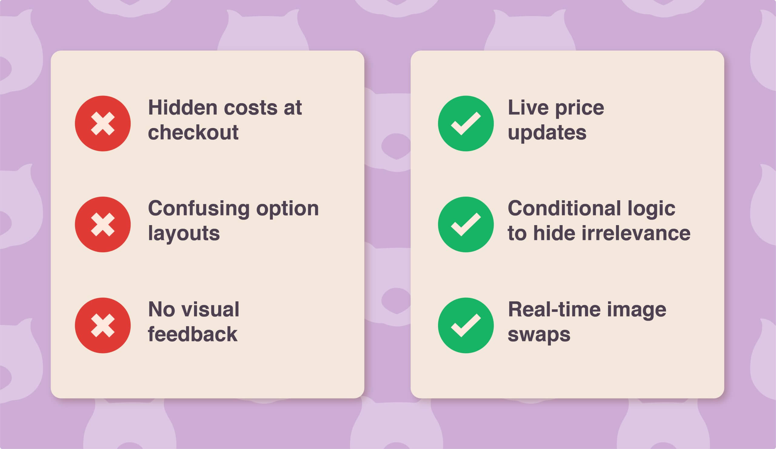
5. Create customizable products with transparent pricing
Customizable products convert better when customers can clearly see the final price and get a visual preview of their selections. Many stores do this poorly, leaving visitors unsure and hesitant to buy.
Customization usually fails when:
- Hidden costs only appear at checkout.
- Option layouts are confusing or overwhelming.
- There is no visual feedback for selections.
Advanced Product Fields solves these issues. As customers choose options, the total price updates instantly, so there are no surprises at checkout. Selecting different variants can swap the hero image automatically, giving instant visual feedback. Conditional logic lets you show only relevant options – for example, hiding an “engraving text” field until the customer opts to add engraving. Formula-based pricing handles complex calculations automatically, like price per m² or bulk discounts.
Other strategies that help increase conversions include:
- Discounts or bundle pricing to incentivize larger purchases
- Limited-time offers to create urgency
- Clean option layouts using conditional logic to reduce decision fatigue
When customization is transparent and interactive, customers feel confident in their choices. This reduces abandoned carts, increases conversions, and makes configurable products a competitive advantage.
6. Build trust signals that match your price point
Trust signals should reflect the price and complexity of your product. Budget items require basic reassurance, while premium or high-ticket products need more extensive proof to justify the investment.
Avoid fake urgency tactics like “X people viewing this product” or overuse of countdown timers – they often erode trust rather than increase conversions. Instead, focus on authentic social proof. Customer photos, detailed reviews, and specific use cases show potential buyers that real people have purchased and benefited from your products.
Guarantees and support options should also match your product’s price. For example, offering a money-back guarantee or free support for premium items signals confidence in your product and reduces buyer hesitation. For lower-priced items, simple return policies and clear contact options are usually sufficient.
7. Use discounts to boost sales without overcomplicating the experiences
Offering discounts can be a powerful way to increase sales, but it’s important to keep the shopping experience simple. Avoid overwhelming customers with too many options or hidden conditions.
With WooCommerce Discounts, you can easily apply a variety of deals to incentivize purchases. These features are easy for customers to understand and provide immediate feedback on price changes, encouraging bigger orders while keeping the process clear and straightforward.
Visual cues, such as quantity swatches, make it easier for customers to select the right amount and see instant price updates. Step intervals and helpful prompts ensure customers are aware if they’ve selected an invalid quantity before checkout.
Advanced options, like conditional logic, allow you to tailor offers and bundles to specific products or user groups. You can also schedule discounts, display custom messages on the product page or cart, and highlight promotions in a way that feels natural and trustworthy.
8. Test and refine
Good product pages are always changing based on information and ongoing improvements. A regular testing and improvement plan keeps your pages working well.
Start with weekly quick wins. Spend around 30 minutes reviewing cart abandonment patterns, testing headlines, and updating images that could improve engagement. Small, frequent adjustments help catch friction points before they significantly impact conversions.
Next, schedule monthly deep dives. Allocate 2 to 3 hours to conduct a friction audit, analyze patterns in customer behavior, and make structural improvements to your product pages. This might include reorganizing content, adjusting option layouts, or refining pricing visibility.
Every quarter, perform a full-page overhaul. Review the entire funnel, update trust signals, and benchmark your product pages against competitors to identify new opportunities. Start with your best-selling products, implement improvements, and then scale the successful changes across your entire catalog.
Putting these strategies into high-converting product pages
Small conversion lifts create exponential revenue gains. Each improvement builds upon the next: faster load times, clearer pricing, and strong trust signals collectively multiply results rather than adding up in isolation.
Most stores pour effort into chasing more traffic, when improving conversion delivers a far better ROI. Start by picking your highest-traffic product page and using it as your testing ground. Perfect it, document the wins, and then roll out those changes across your entire catalog.
Remember that high-converting product pages are a result of careful optimization, not luck.
If you want to speed things up, plugins like Advanced Product Fields for WooCommerce help you create customizable, transparent product pages without complexity. It’s one of the simplest ways to put these strategies into action and start converting more of the traffic you already have!
